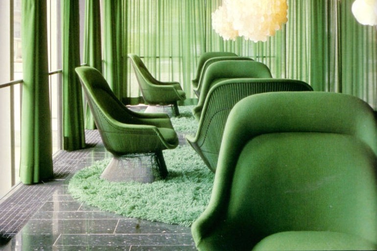
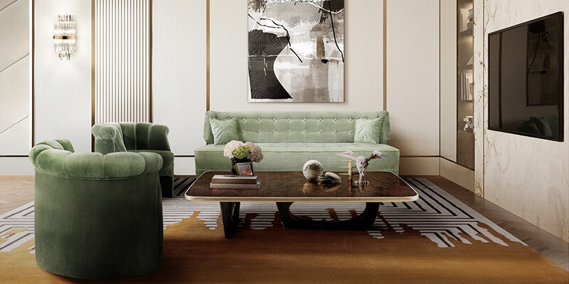
Pantone color 2018 verdure is one of colors that will dominate 2018. Let’s discover why and how it is possible to use this color in your interior design.
SEE ALSO: 3 Questions To Ask Picking Up A Dining Room Chairs
Verdure palette comprehends “vegetal” tones. If you’re looking for a decor change, and you want to be sure that your home décor will look trendy, the Verdure palette might be exactly what you are looking for. Color-blocked artwork, bold kitchen cabinets, and plenty of indoor garden goodness await you.
Verdure is a fresh color that give elegance to your living room or dining room. Your chairs will bright and result will be amazing. Verdure recall nature and wildness. It embodies the perfect elegant style and no one will resist to its style.
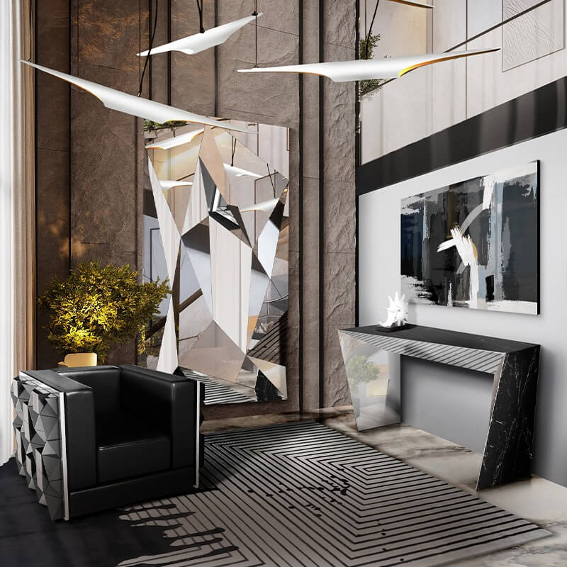
It is possible to mix colors and not just use verdure alone. This is the right solution especially if you have a big room just to break the monochromatic theme. For instance it is possible to mix dark and bright colors to obtain a stunning effect that will be appreciated by your family and your guests. No matter if you want to opt for a modern or traditional interior design, mixing colors is always a suitable solution.
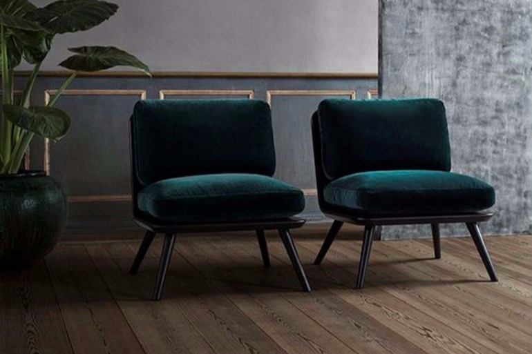
While using verdure color you should take into consideration the surroundings. Use soft tones around and be sure that everything fits together. Otherwise, you should consider changing part of your furniture to have a better overlook. In fact, harmony is very important while choosing the furniture for your home décor.
What do you think about this article? Let us know, we are curious! For more modern interior design inspiration and decorating ideas, don’t forget to visit our Pinter-est and Instagram account!


